
When Nike took over the NBA’s uniforms, they made it clear their goal was to keep uniforms fresh and allow teams to be more creative with what they wore, providing the opportunity to add new alternate uniforms just about every season.
That creativity can be something of a blessing and a curse for teams, as teams far too often move on from a hit uniform design — like the Heat’s Vice look that they, for some reason, have gotten rid of — while forcing teams to feel like they have to crank out a new uniform every year (in part to sell more merch). That means we probably get more duds than we do winners across the league as a whole, and this summer hasn’t exactly been a resounding success on the new uniform market. Utah’s complete rebrand has been dreadful, as they now look like a made up team in a movie that couldn’t get official licensing, while the Cavs new uniform set is hit and miss.
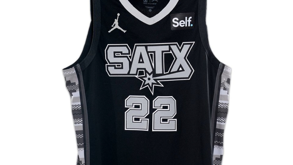
On Monday, the Spurs joined the new uniform party with a single alternate, their Statement Edition uniform, that somehow manages to hit and miss all in one.
Culture isn’t just where we’re from. It’s where we’re going. Introducing our 2022-23 Statement Edition uniform!@SelfCreditApp | #PorVida pic.twitter.com/a2JrGGHLDl
— San Antonio Spurs (@spurs) July 25, 2022
And here are the new Spurs jerseys for next season, #SanAntonio . #porvida #gospursgo #nba #nbatwitter pic.twitter.com/iL03tgVM1i
— JeffGSpursKENS5 (@JeffGSpursZone) July 25, 2022
The shorts are good and the Mexican serape print on the side is a nice touch, but it’s all ruined by the font disaster on the front of the jersey. The mismatched font between the letters and numbers is bad on its own. It is generally too blocky, but made worse by the fact that SATX might be one of the most aesthetically displeasing combinations of letters you could throw on the front of the jersey. I get what they’re going for here, but it simply doesn’t work. This has the potential to be a good uniform (and the shorts are already there, I like the Texas logo and the print on the striping) but the jersey just drags it all down with the font and the choice to go with SATX.
Source: https://uproxx.com/dimemag/spurs-alternate-uniforms-satx-photos/