
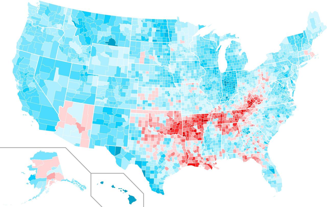
Swing between the 2004 and 2008 US presidential elections. Blue areas show where Obama did better than Kerry, while red areas show where McCain did better than Bush.
Viral News
Swing between the 2004 and 2008 US presidential elections. Blue areas show where Obama did better than Kerry, while red areas show where McCain did better than Bush.