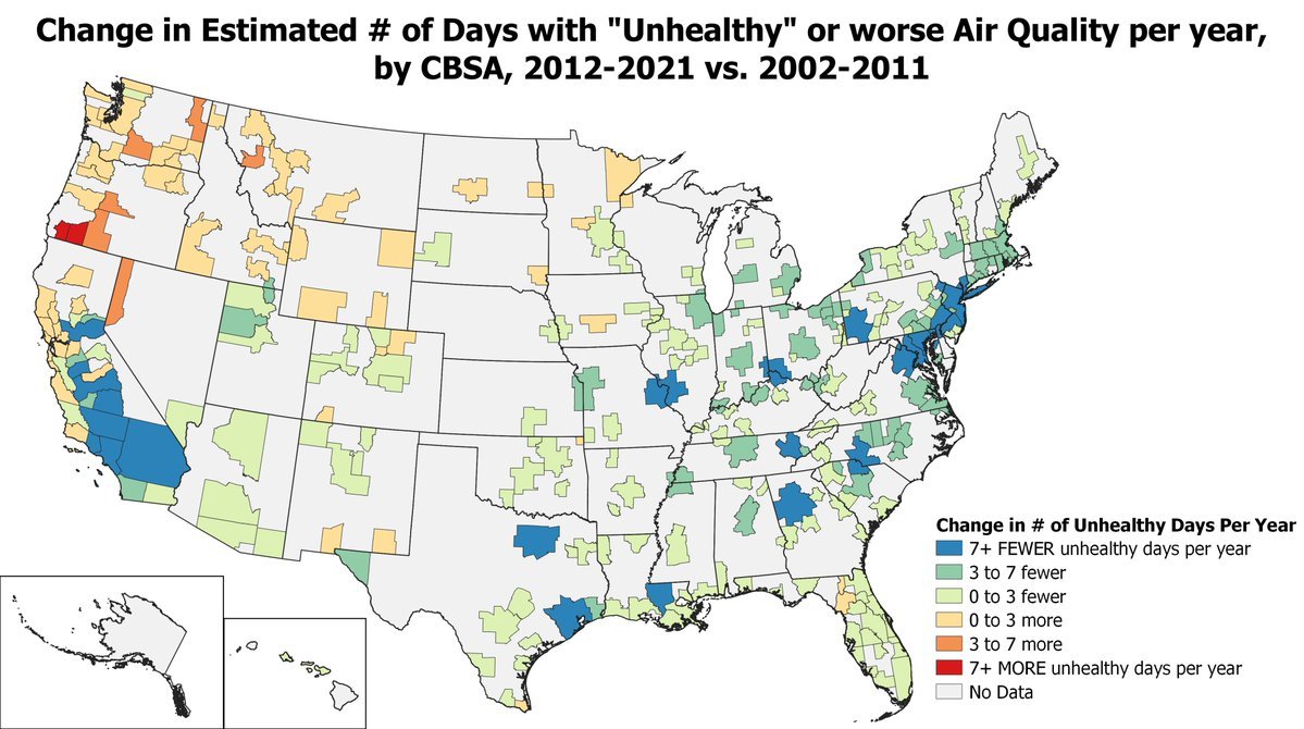

Map comparing the estimated # of days with “Unhealthy” air quality in 2012-2021 vs a decade earlier, 2002-2011
The # of days with unhealthy air quality declined in most metro areas (green/blue), but increased (orange/red) in the northwestern US due to growing smoke from wildfires
by @Mill226